
Introduction
< Another perspective, Another iteration
Portrait of a process
There is no shortage of design process diagrams. Generally, there seems to be wide agreement between diagrams describing stage-gate, agile, and waterfall design processes. While they all share a common pattern of, roughly speaking, research, define, design, test, release (or build then release etc.), there seem to be as many diagrams as there are companies. Consulting companies might promote a unique variation in the steps, or iterative activities. A corporate design department might call out specific substeps and define phases using alliteration, clever acronyms, and terms more relevant to that company’s products and brand mission.
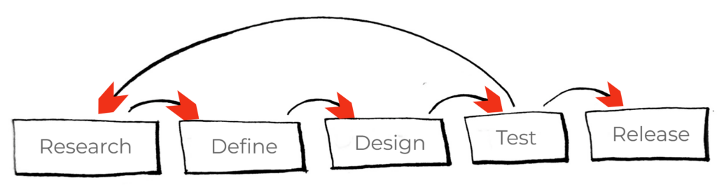
The classic design process diagram, with an iterative loop across development phases.
While I always appreciated these visualizations and the power they had to organize team effort, ultimately, the splinter in my mind was still there. Again, it was not so much that these processes were not working. The success and proliferation of user-centered design and design thinking has been clearly demonstrated, and we are fortunate to find ourselves at a time where design and user-centered thinking does have a “seat at the table”. By contrast, 20-25 years ago many designers found themselves in a battle to not only justify the cost and need for such methods, but the need for their existence at all. At this point, I tend to believe that most companies have learned the competitive advantage provided, and needed, by good user experience.*
One seminal turning point, at least for me, was the 1999 special on ABC News highlighting IDEO’s design thinking process and its shopping cart redesign exercise: IDEO: Shopping Cart Design Process. While I do believe there has been incredibly positive progress, I also acknowledge that many people can still find themselves waging a battle to justify the value of “good design” process.
Perhaps, one of the most important attributes of these UCD process diagrams is that they are easy enough for everyone to understand and follow. They tell us, among other things, if you are designing a product you want people to use, involve those people who are using it. You think you know your users? Come watch some usability test sessions and you will see what you are missing. The benefits of UCD will quickly become clear. If we can distill these benefits into an easy-to-follow diagram, with a few steps and an iterative loop, we could have a magic formula for success. And, on average, it certainly seems like it is! As a teaching tool, as a rallying cry, as a crest on the flag of good design, such process diagrams help lead a team to success.
However, as a representation of the experience of design, something seems missing.* Something about this infographic didn’t quite fit with what I regularly saw happening.
*The design squiggle and others I mentioned in the About chapter are good examples.
Let’s take a sequence we assume is logical and efficient: it makes sense that you would “define” (e.g., create requirements) before designing. But, I would often see designs getting started with incomplete requirements, and requirements being shifted, added to, reduced or eliminated upon further influence of design practicalities. Ok, perhaps there is a back and forth nature to design and definition. We’ll allow a little inconsistency. Elsewhere, we can see that user research should come before definition in order to ground requirements in user needs identified by the research. But, I would also see that the definition phase itself would reveal that the early user research had gaps and could not answer the questions posed during definition, so more research would need to be done. Another back and forth relationship. Now, if design were another variable happening at the same time, then of course, research and design have a direct influence on each other too, even though early user research does not come directly before design. Ok, I can draw a little connecting arrow back and forth there too…I guess.
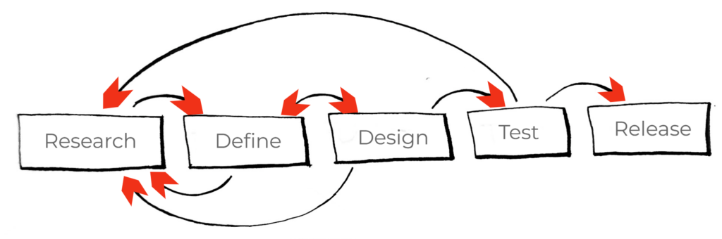
Perhaps we can assume some minor deviations in process.
These situations happen all the time. The solution? Of course you include stakeholders in discussions during the definition phase. But, didn’t research come before that? No problem, we bring everyone together at the project charter and develop a vision statement. But, what if one particular person was not in that meeting? What if they weren’t fully engaged, or in a bad mood that day? What if, like many people, they couldn’t quite envision a product experience in the abstract, but could dissect a design’s shortcomings with remarkable precision once they could hold a prototype in their hands? What if the design’s features weren’t even imagined at those earlier stages and therefore couldn’t be predicted as having a profound impact on the success of the product? For every potential solution to the problem of unexpected changes, there is a scenario that will make predicting change impossible.
Recognition of the constant opportunity for change is not new. One of the people credited with creating our modern waterfall model, complete with some of the essential caveats, was software engineer Winston W. Royce in the 1970’s. As described in Wikipedia “…his intended improvement upon his initial “waterfall model”, illustrated that feedback could (should, and often would) lead from code testing to design (as testing of code uncovered flaws in the design) and from design back to requirements specification (as design problems may necessitate the removal of conflicting or otherwise unsatisfiable / undesignable requirements).”*
*Despite the mix of editors and references, I feel this page captures the general idea of waterfall in a concise manner. I also found the writing consistent with what I concluded simply looking at Royce’s final sketch directly.
This is not the same as saying that the design process steps iterate as a loop. Few would argue that this macro-characteristic does not exist in development. However, it’s impossible to know how idiosyncrasies within steps will impact the plan and our sense of stability with our tried and true process. Mike Tyson once said, “Everyone has a plan until they get punched in the face.”* This means that what you do in training and what you have to do in the ring are different, sometimes very different, depending on what happens when all the variables are live and happening in real time.
* Tyson quote, and variations. I like this particular reference. See a funny post from “David H”, and a few other variations from history posted by “John McGlothlin”.
Perhaps such a brutal metaphor is more true in endeavors that involve a high degree of creative thinking and new ideas, and perhaps less so in other development scenarios. For example, when you have a product you want to make a slight upgrade to in order to keep pace with the market, you might have a good handle on 90% of the process because all of the mechanics, features, and value propositions are essentially the same except this one particular update. There is no reason to think that the design and validation process can’t be followed like clockwork. The same goes for engineering certain structures. If the calculations can be applied, and this product or construction has been done hundreds or thousands of times before, then team members should rightfully feel a sense of confidence in applying a wholly predictable process. We see this in software products as well. The agile development process exists, in part, because you can make incremental changes that build upon lets say, a major release or the first release, which happen less frequently.
Nonetheless, the more variables there are, the more the unknowns, the larger the endeavor, the easier it is to predict unpredictability; that we will see more idiosyncrasy, more back and forth between more steps, between inputs and outputs, before we evolve into the “right” product. This really does a number on our UCD process diagram.
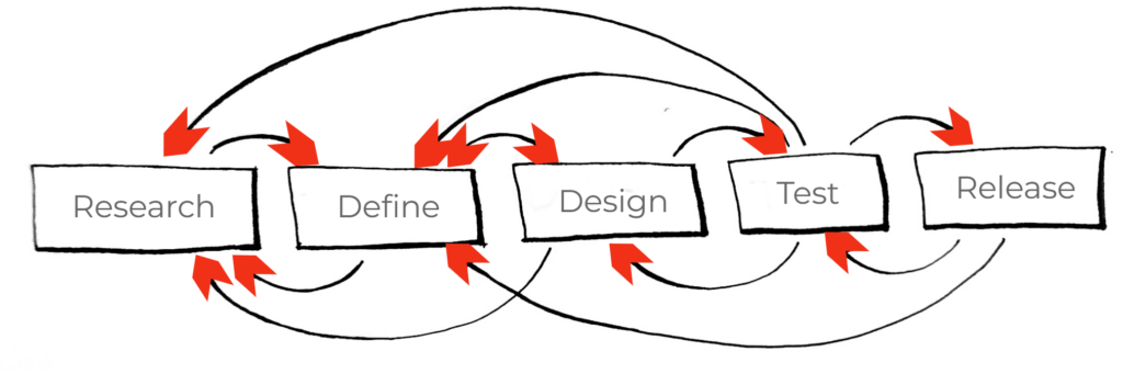
Oy vey…
As the graphic above demonstrates, we can always find fault with oversimplification. Or, we can take the typical design process diagram at face value, as an instructional infographic. Maybe we don’t need to convince people that the process, as a general philosophy, works anymore. Maybe we don’t need to teach or follow the basic principles any differently. Maybe the process is a bit chaotic and non-linear, not because we didn’t have the perfect infographic to follow that includes a break out for every little nuance or path that you might have, but because that is simply the nature of the beast.
I realized my nagging feeling wasn’t about trying to “fix” the process or argue about its validity. Instead, I asked myself, what would it look like if I painted a picture of an experience instead of a workflow. What would it look like to visualize what happens between all these people and what they produce, not between principles and practices?
We don’t need another addition to the industry’s litany of UCD process diagrams. But, would breaking down the components yet again, looking at the pieces in a different way, painting a different portrait, be useful, even to myself? Without worrying about how it looked or how easy it might be to follow, I began sketching. As you might expect, It went off the rails very quickly. My sketches looked like a Mirro board vomited after eating all its own templates. The point is that there were too many possibilities to draw the right direction; I suppose everything could have double arrows between every other step, substep, and stakeholder. Also, if a loop represented an iteration of some kind then what defined the iteration? We as team members iterate our aspect of the product at different times based on our roles and responsibilities, with varying levels of impact on any other aspect (e.g., between marketing and engineering, UI design and analysis). Any given stage of product development was less like a series of steps with loop backs and secondary paths, and more like a rolling system. There was obviously some item of focus that everyone aligned to. No matter where you sat, or what stage you more or less were responsible for (e.g., researchers during research, engineers during engineering), everyone was, whether they realized it or took advantage of it, connected to each other through the shared “hub” of the project. The solar system might even be a good analogy: the gravity of the project we are all working on keeps us together, spinning around it.
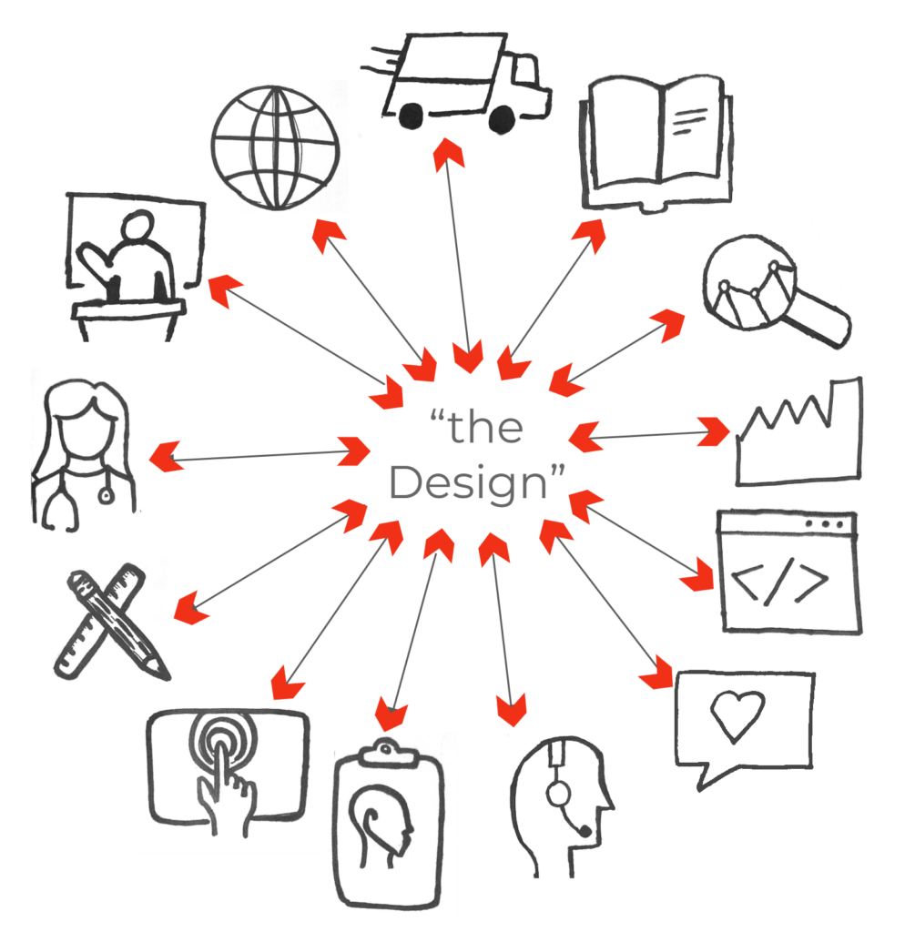
All of our roles connected to each other by “the design”
“Ok that’s great Cory, so everything is connected to everything…that’s super helpful…” (intentional sarcasm). Not to mention, the visual of a circle with nodes is not a particularly groundbreaking way to depict inputs to a “thing”.* But, my goal wasn’t to picture a new process, or what it should be like, only what it seemed to be like. Then again, maybe this is what it is supposed to be like.
*as an example of how generic (or generalizable) this metaphor is, here is Ken Burns recently describing historical perspectives like spokes on a wheel around the hub of an idea – at ~54:00 into this Joe Rogan podcast
Like strings connecting a common center point, when one string pulls more or less on the design of the product, all other connections will be affected as well. If we were to follow the principles of good design thinking, they would tell us that no one should be shut out, all ideas are welcome, and diversity are key assets. In a way, much of what we try to do is ensure that projects optimize a cross-disciplinary approach because the basic truth is that all products are developed by a variety of disciplines – products simply cannot be developed, manufactured, sold, and supported otherwise. To make a long story short: it takes a village.
Theoretically, our old standard diagram does not exclude these qualities. Much has been said about how to keep your eyes open no matter what stage you are in. Perhaps an alternative visualization would be the standard UCD diagram extending like fractals where each stage contains within it smaller cycles of the entire process. Aside from this being difficult for me to sketch, it didn’t seem to quite match what I see happening because within these mini rounds you don’t necessarily repeat ALL of the steps on a smaller scale. Perhaps you only get a little bit of interaction between design and engineering, or a round of discussion between research and sales, or manufacturing and design, or any other myriad combinations of ebbs and flows, of team members interacting with each other (planned and unplanned) to push the product development forward. I thought about how to visualize this phenomenon as well, realizing that the missing dimension to this portrait was time.
Stepping back, reducing to first principles, we can ask, “What does the design process do?” One of its more fundamental characteristics is that it iterates across time. In this regard, the process can seem to bumble along like a series of loops. We know from experience that some loops take more time, more money, more expertise. You can see this in large phases that a company predefines (e.g., Phase 0,1,2) or in individual tasks within phases (e.g., developing each feature). The difference is more a matter of scale than process. Perhaps there is often no inherent reason why we couldn’t turn one big loop into three smaller loops, so long as it occurred before a “major” gate or threshold.
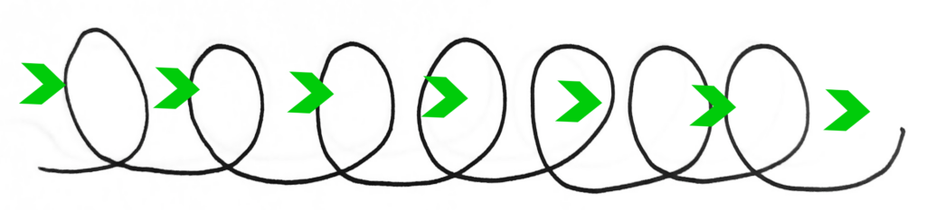
Tumbling along in cycles
Time can equate to iterations, it can equate to stages or phases, it marks the passing of gates, or plants flag posts when people assume gates are reached and later planted again when decisions need to be reopened. Time is what allows any given iteration to not be perfect because we count on that fact that we will do it again. In fact we value iteration over perfection because we know the value of testing, trial and error. Linking up a series of these “wheels” of interaction between product concepts, users, stakeholders of any combination or variety, captured a critical truth of the experience: no single iteration is expected to have everything. Transposing this way of looking at the process back to the traditional stage gate process or simplified UCD diagram, it still yielded an accurate, albeit different, portrait of what I experience; more spokes related to user research in the first few spins, for example, and then in the last few, more spokes related to validation. If development proceeds “neatly” and predictably, then great. But, there is no need to remove spokes (i.e., remove seats from the table) at any point, it’s only a question of which are present or more or less active at that time. There doesn’t seem to be a limit to the number of spins, or their size. It is simply a repetition of little evolutions across time – spaces we create as a place to work together and fit the conversations and interactions we want to, are able to, or just so happen to, have at the time.
This picture of a spinning, evolving, series of interactions and inputs could be different, even random, each time you drew it, yet still hold a recognizable shape and direction. It began to feel like what I have experienced over my career. It felt like what I have heard others describe and observe over the years, some of which painted their own picture that reimagined what the design process was like (e.g., the design squiggle).
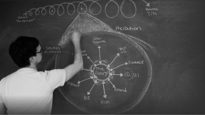
Since I first sketched on my chalkboard in 2013, I spent a long time noodling on whether it made sense; should we think of the process of designing as being both a structure and a non-structure? Do we simply chalk it up to the imperfection of human beings vs the “order” of a written plan? I played with this idea, observing more keenly whether such interactions and patterns happened like this. I made it part of my working outlook, shared it with my teammates as a means to inspire collaboration. A few of us instantiated some of the ideas into a conference poster, blending in the concept of a network structure for medical device design, more reminiscent of FDA’s Total Product Life Cycle (more on FDA later). Throughout this I tried to be unbiased and not artificially influence how the process played out in the many projects I was a part of. Frankly, I was too busy working hard, trying to do a good job to apply some unnatural master plan. As I said previously, my goal in all this was not to invent a process.
In fact, my observation has been that the traditional design process works REALLY well to help guide activities. This can include the various standards and guidance documents that set forth relevant requirements to be met and even how to meet them. But these aren’t necessarily going to give you, nor should they in my opinion, the answer to dealing with every logistic and dynamic of how your team works on a product. It was more that there was this underlying level of significant dynamics that tend to go unsaid, unrecognized, and/or unconsidered. In a fast-paced world, we will follow what is in front of us. Meaning we will meet the requirements and deal with the rough edges if it generally seems to work out in the end.
But, the more time went on, the more I felt it was useful to dive deeper, to actually write down the thousand words of a picture, so to speak. If nothing else, I wanted to remind myself of these important dynamics at play under the surface of the process. Not just on each project, but each meeting, each brainstorm, each chat I had with my teammates. I noticed that the more I focused on the people involved*, not just the problems to solve, I was able to improve communication, garner more valuable inputs and insights, and facilitate more cohesive solutions.
* Who they were (stakeholders and teammates, not just users), Where they were, What they did, How they did it, When they were taking actions, and of course, Why to all of those.
Enhancing communications also had the effect of enabling more iterative cycles, refinements, back tracking, and gear-switching that let us find the “right” way. Why? Because what makes reconfiguring a solution difficult is not the mechanical work, per se, it’s the people. People have responsibilities, timelines, opinions, experience, and goals bumping up against anything you are trying to do collectively. All of these variables exert some amount of force on the process, and therefore “the design”, that can be difficult to determine or even notice. Our responsibility might only be that we ensure that our little push or pull is felt by everyone else. What we do in one aspect of product development can so easily be overlooked, and unconsidered by other areas that, by definition, will be impacted through our interconnectedness running through some central idea we are sharing in (like a wheel with spokes, like a spiderweb). Admittedly, the impact could be minimal or even inconsequential. Stakeholders should have the freedom to apply their expertise, and we do not need all decisions to be made by committee. But, that one decision that causes the slightest impact and pull to one direction could be the one thing that makes the most difference to success or failure. We simply can not know for sure, but we can communicate. Thankfully, there is no shortage of writing and training on team and personal communication skills. The point here is not so much which training is best for you or this team vs that team. You and your team might try different methods and have different ways to communicate even depending on the person (a skill on its own). This is simply a reminder, an encouragement, to be aware of and hold closely the importance of good communication – it’s worth the effort.
This undercurrent of dynamic interaction between the people and the product is perhaps the hidden “portrait” of the design process, the flip side to the common portraits of steps and connections. I felt the abstraction made sense; at any given stage, people are working together around an idea that evolves and also pushes back with each input, evolving and enabling communication. With each step, or cycle (big or small), there could be more or less people involved, but it would repeat with the same basic architecture, until it was fully vetted and realized. Yet, I wondered if there was a further reduction that could be made, some unseen dynamic that underpins design, driving the wheel and the spin, like atomic particles in the nucleus of our collective effort. I landed on a yin-yang like idea of “Perspectives” and “Iterations”, the title of this book’s two main parts (I suppose it struck me as being easy remember too). “Perspectives” represents our influence on the design. “Iterations” represents each version we make. The addition of one to the other generates the need to repeat the cycle; cranks the engine, if you will. Practically speaking, without robust communication between perspectives, iteration is not optimized. The fewer the iterations, the lower the chances are that we uncover the optimal solution.
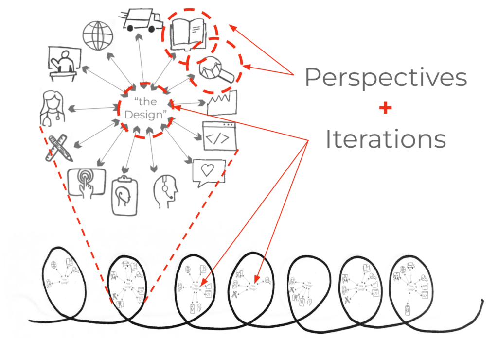
The Perspectives (i.e., the roles and people) react/input to the current Iteration, which then forces the next iteration, which will in turn be reacted to by the same or different Perspectives, and on, and on…
This way of thinking was helpful to me, but I wasn’t sure it was worth sharing – maybe everybody already knows this. To some degree, I think many people do. As I mentioned in the About section, I found many people making some of the same or similar points (see About, Similar ideas).
However, I can only trust that there is value in each perspective, in the same way there is value in every perspective of a team, or the way one artist sees a subject vs another. I am fairly certain there is room to paint another portrait of the design process, which I offer to the mix in hopes it can contribute to easing that nagging suspicion that there are important things going on, something that we know is there, but don’t quite know the best way to talk about.
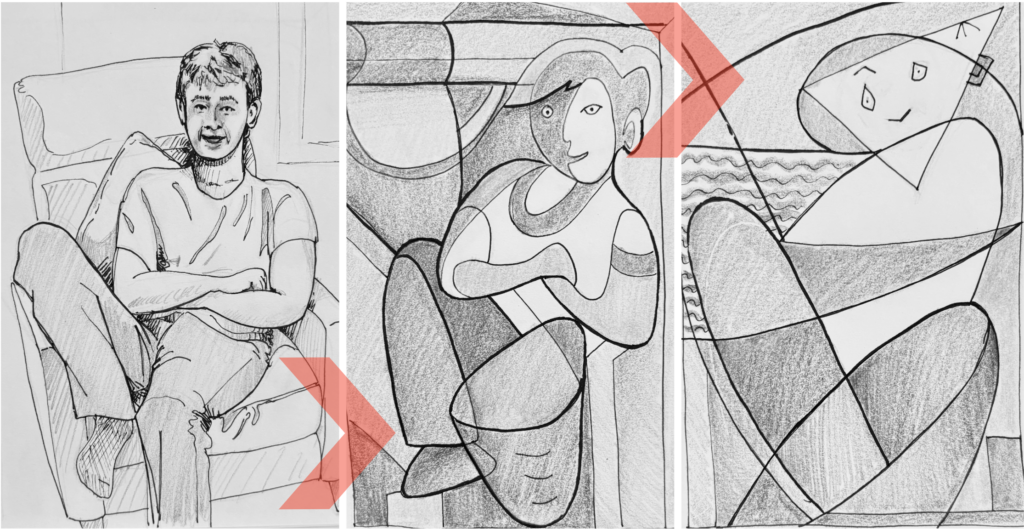
Above is my humble exercise inspired by Picasso’s perspectives on the same subject (reference works from left to right: Young Woman Seated in an Armchair, 1921-1922, Seated Woman 1927, Seated Woman 1930)
Perhaps this work can inspire more conversation and consideration not so much about the processes, methods, and techniques themselves, but about how we, the people that are engaged in the process, deal with them. There might always be some amount of discomfort any time people have to adhere to a process. Despite best efforts, perhaps there will never be a process that can perfectly fit and prescribe all of those things we do, let alone experience, in the act of creating. I find this comforting. It tells me that there will always be room for people, and a need for those people to communicate.